 Does this look comfortable to you? |

|

|

|
Recipes
Dessert
 Banana Cream Pie |
 Pumpkin Muffins |
 Grandma Meyers Sugar Cookies |
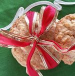 Eggnog Cookies |
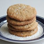 Coconut Cinnamon Chocolate Chip Cookies |
 Strawberry Rhubarb Mini Pies |
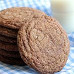 Gingersnaps with Fresh Ginger |
The Bob Dylan Quilt Series
 Set up & Prep |
 Cutting & Interfacing |
 Cutting & Assembly |
 Batting |
 Batting & Border |
|||
The Bib Series
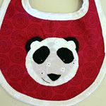 Applique |
 Make your own Bias Tape |
 The Finished Product |

|
Crafts
 Frankencard Christmas Cards |
 Paint Chip Christmas Cards |
 Fabric Cutout Christmas Cards |
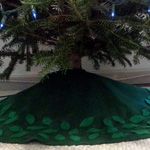 Felt Leaf Christmas Tree Skirt |
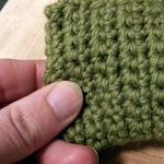 Knitted Catnip Toy |
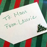 Evergreen Christmas Tree Gift Tags |
Gardening
 Winter Gardening |
 State of the Garden 2013: "Will it just get warm already?!" |
 State of the Garden 2013: "Things like to LIIIIIIIVE!" |

|
Topics:
QuinnStitch: The Future!
I turned 30 today.
Christmas Revelries and Microbes who Hate Me









Nice archive page! I was going to warn you that these are a total pain in the butt sometimes, but looks like you didn't have much trouble :)
ReplyDelete1) It took me about a week of fighting with HTML for it to look like this.
Deleteand
2) I totally copied you, I hope you don't mind. haha :)
1.) Um, I know. Blogger HATES allowing this archive to look and function correctly. It's a constant struggle. I update mine once/week, and it's the most dreaded task of my week. It STILL gives me trouble. Make sure you make backups of the code before you update anything, each time.
Delete2.) Of course I don't mind. I copied it from here, if this helps:
http://www.laurascraftylife.com/2011/12/blogger-image-gallery-tutorial.html
Also, we'll have to discuss this when we're together next, because you've gotten yours to look way neater than mine. The main problem with mine, is that I just can't get the spacing between the section header and the start of the thumbails to be consistent. Like, on my recipes page, the space between "Poultry" and the thumbnails is huge. The space between "Seafood" and thumbnails is less huge. And the space between "Meat" and thumbails is tiny. Frustrating. We'll discuss.
Delete